
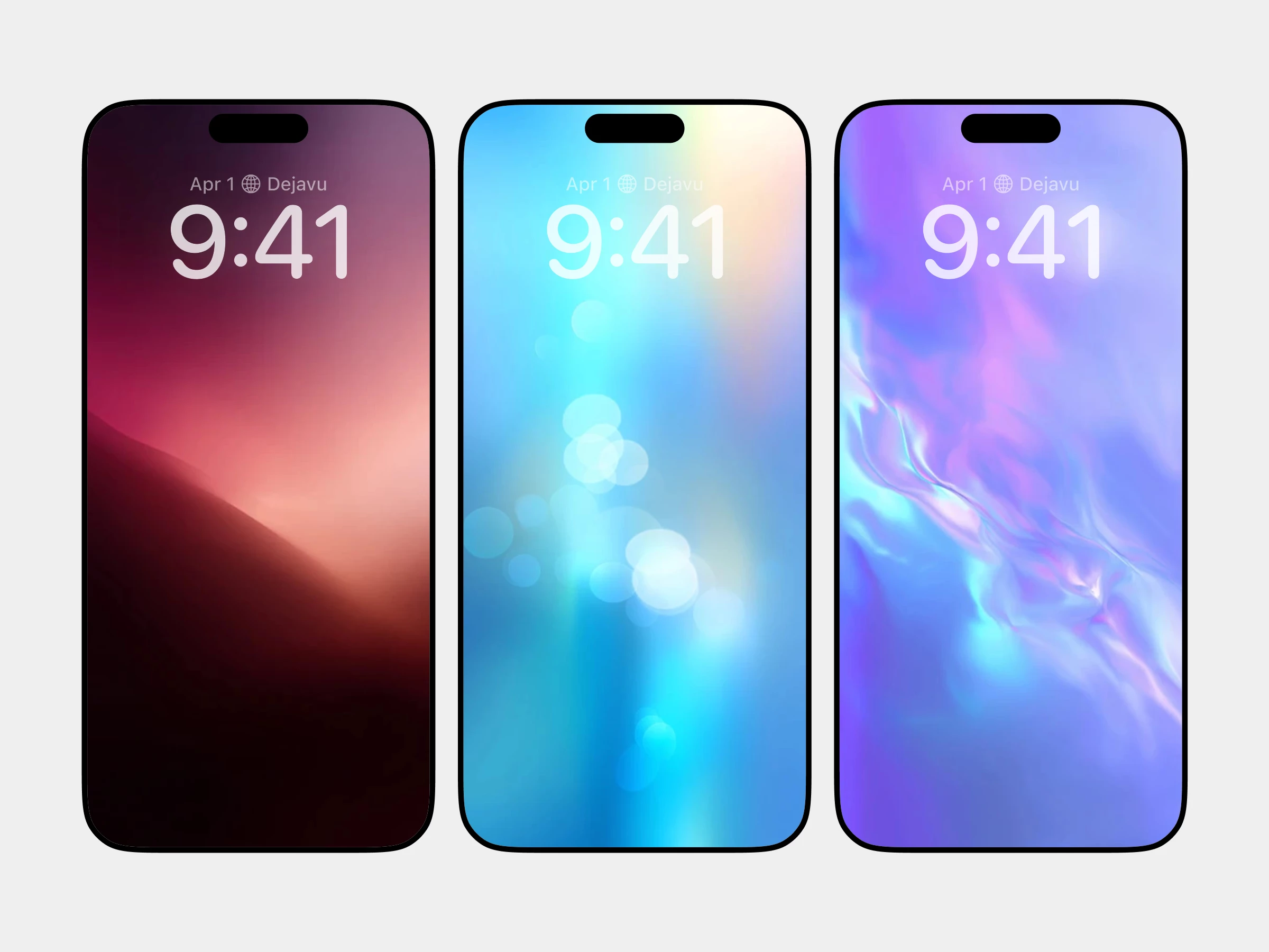
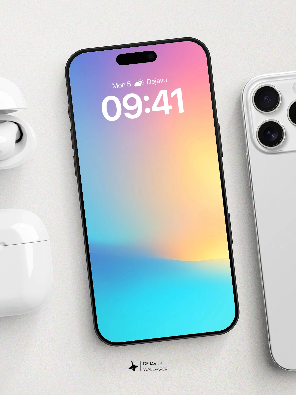
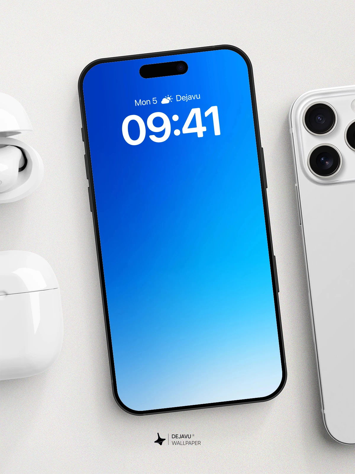
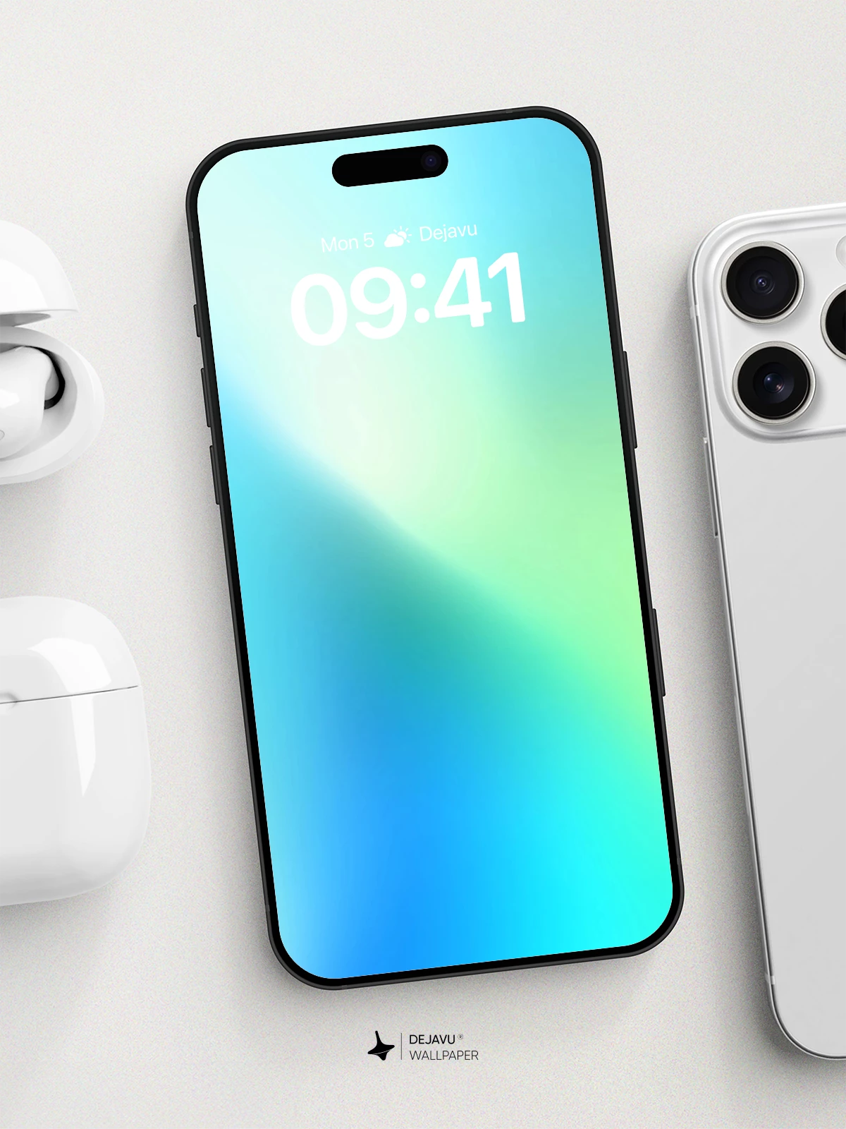
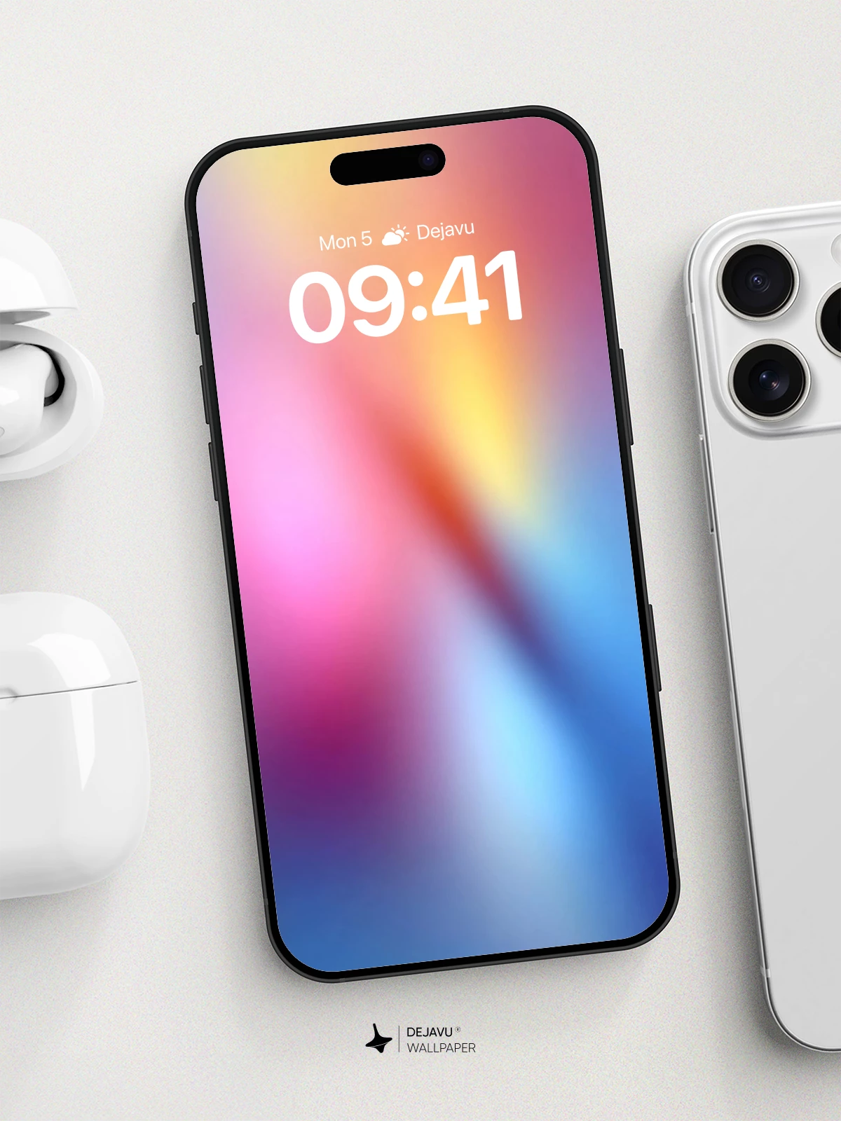
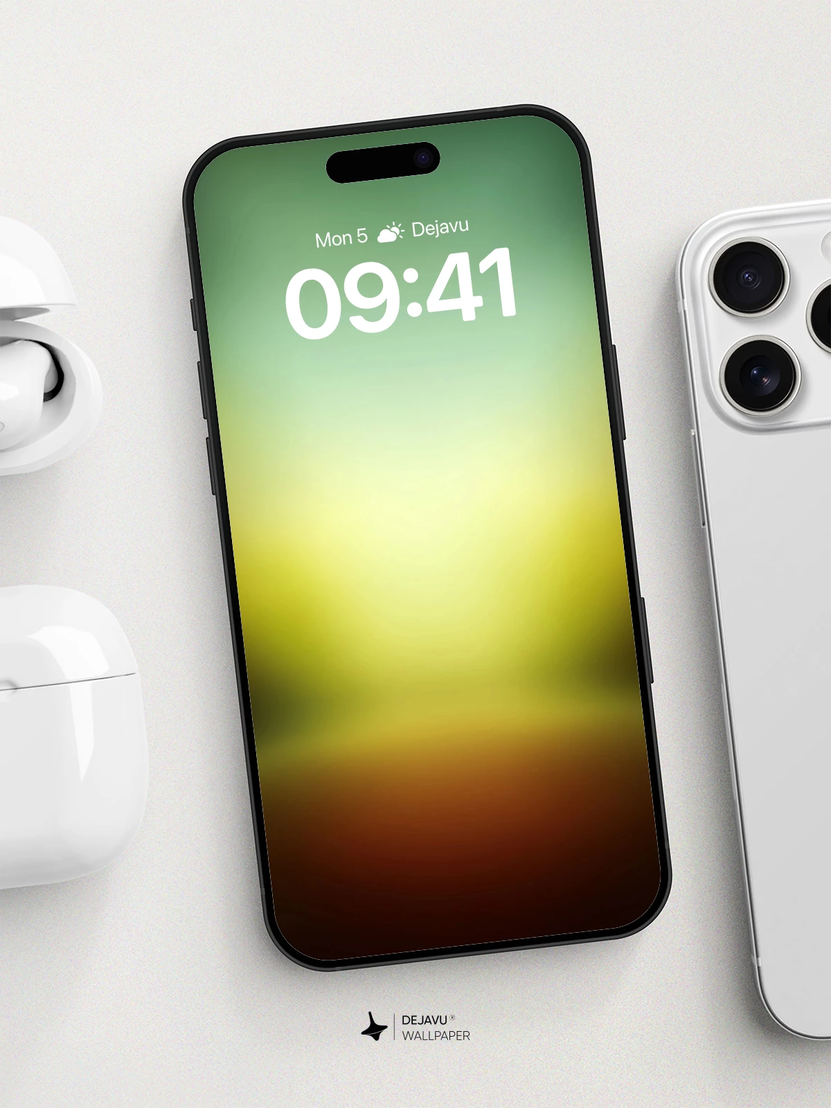
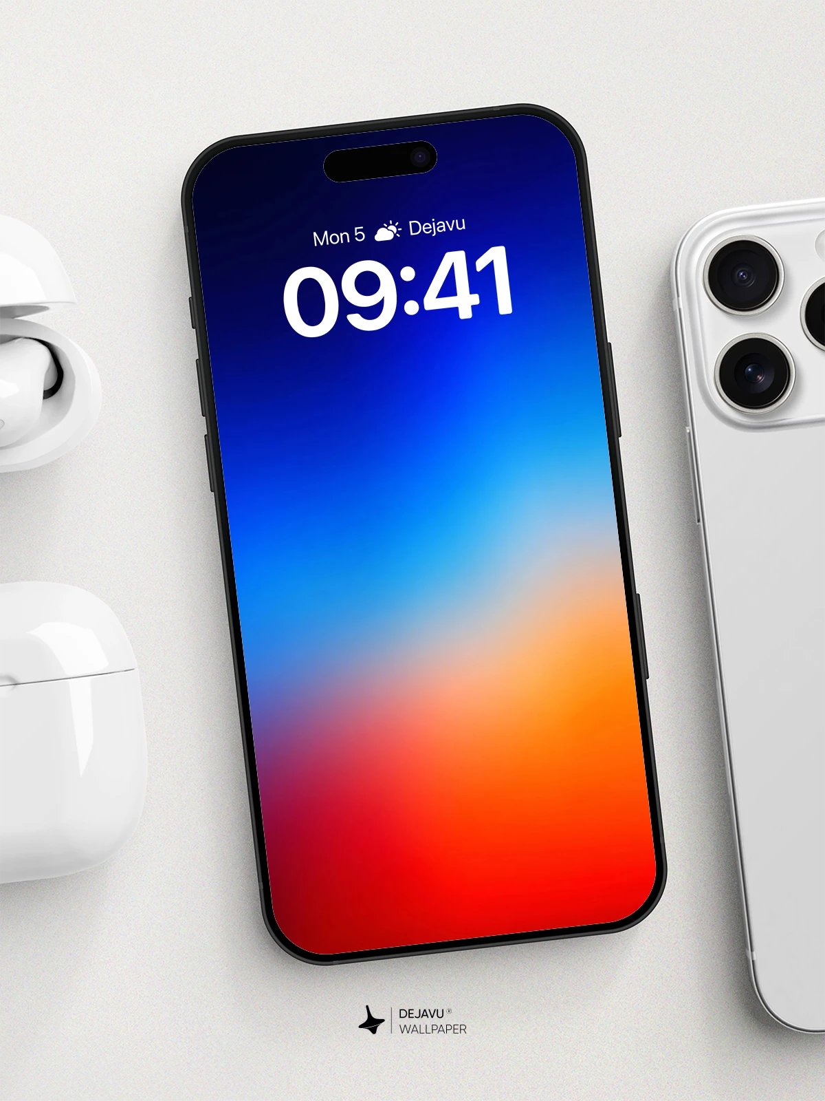
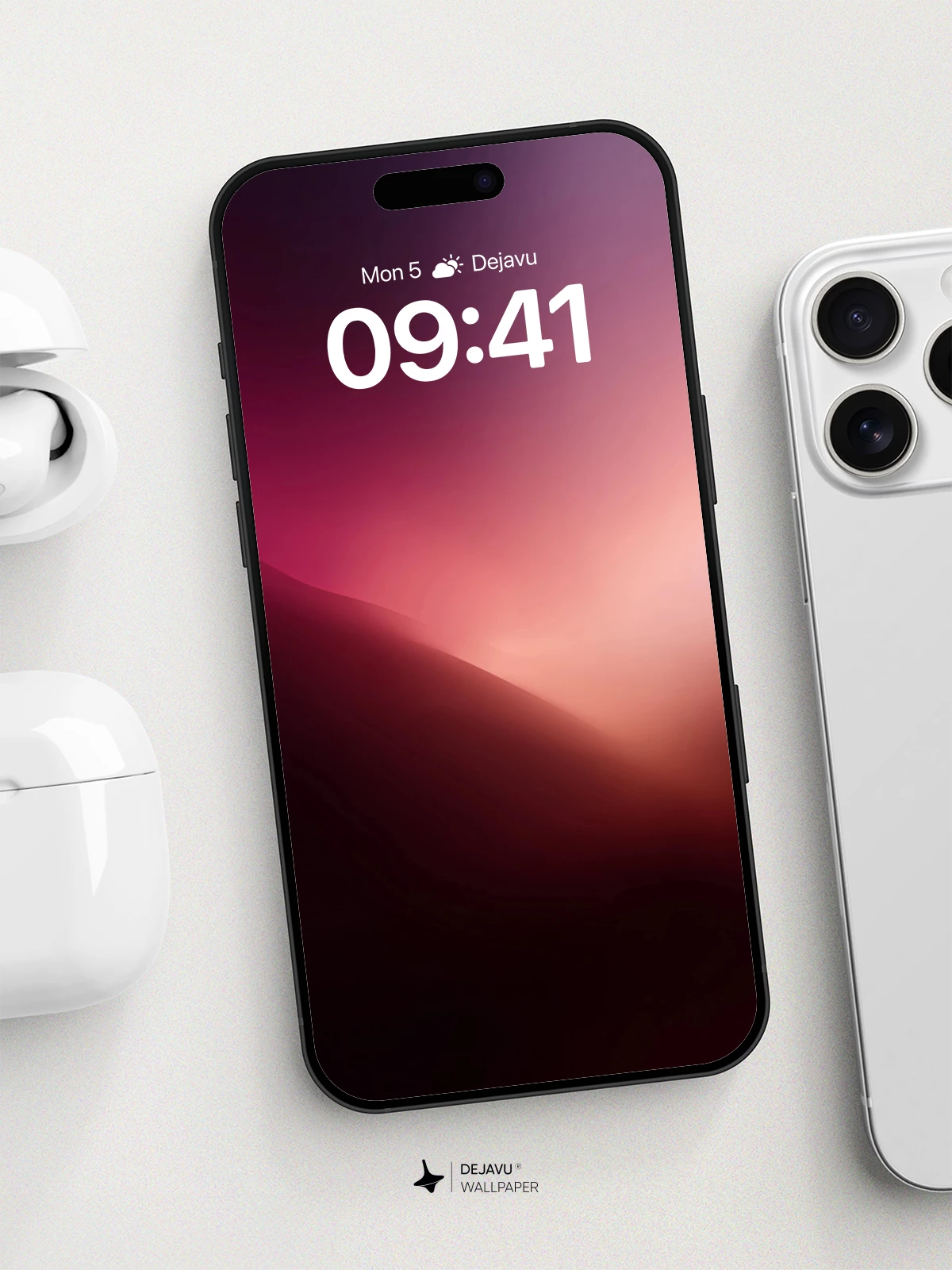
Gradient aesthetics dominate modern digital environments, offering serene visual experiences through smooth color transitions. These minimalist compositions reflect a cultural shift toward emotional regulation and sensory clarity in technology. Rooted in psychological comfort and design simplicity, they serve as both background and mood regulator in everyday digital life.
You can download all these wallpapers on Dejavu Wallpaper!
Experience the magic of AI in advance! Let the infinite imagination of AI decorate your screens, bring you fresh delights every day.


Related Products
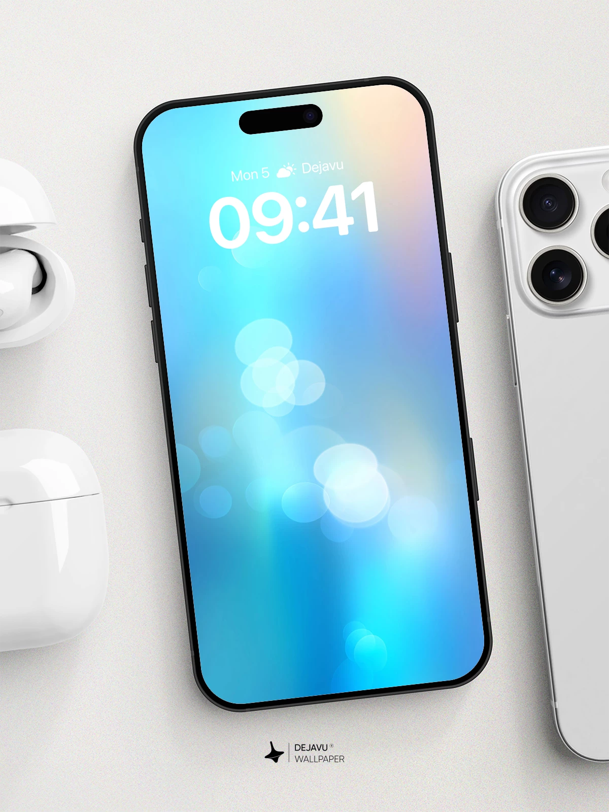
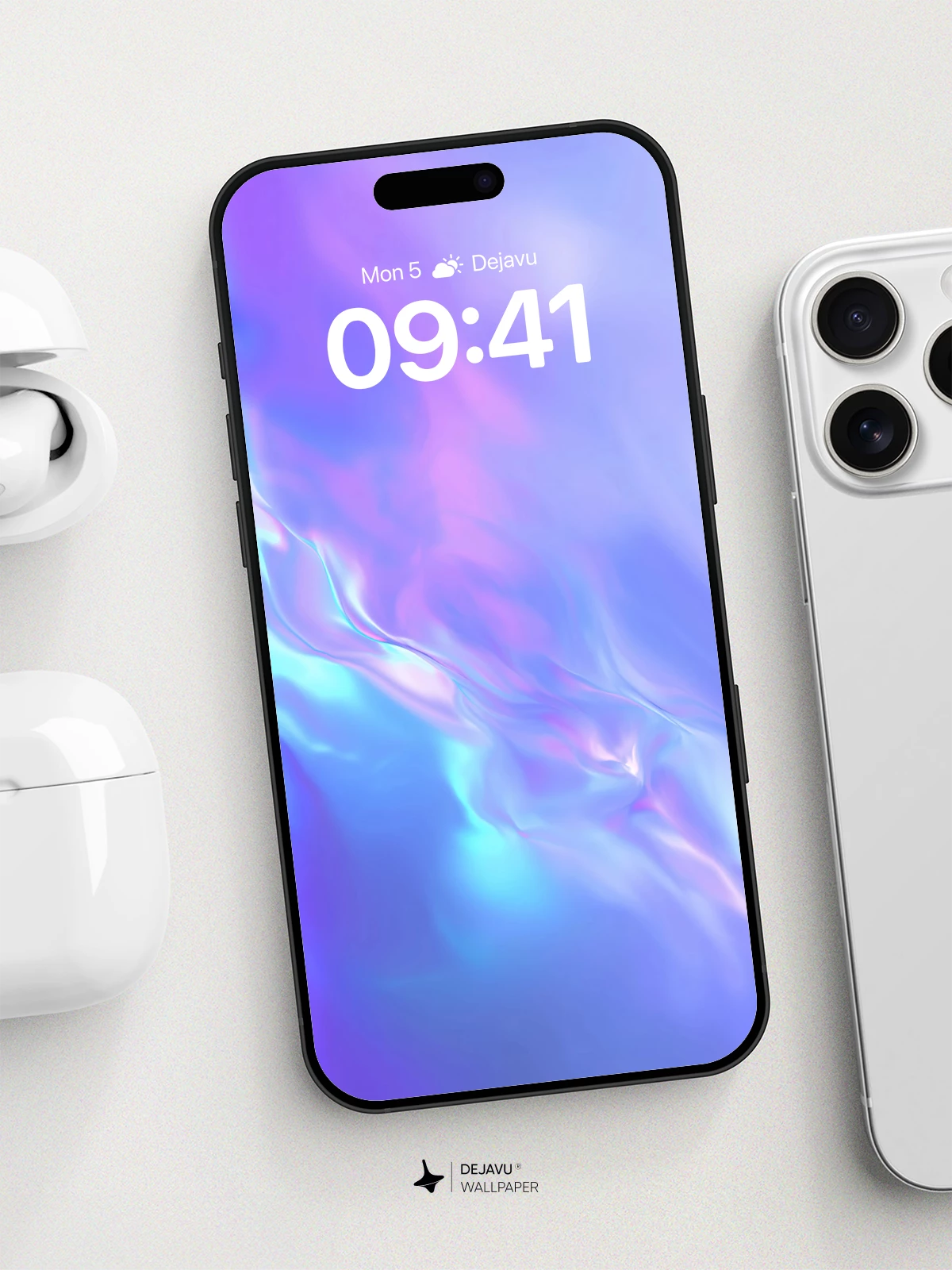
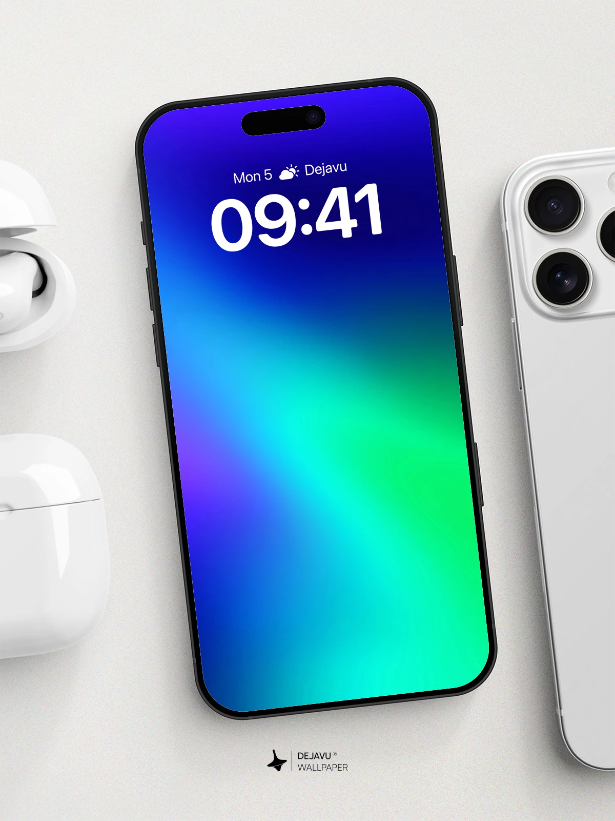
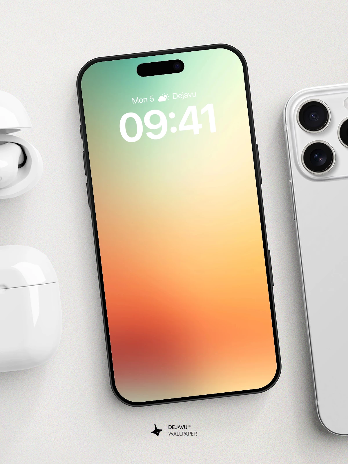
The flow of color reshapes perception without physical form. When light and shadow detach from concrete shapes, they become vessels for emotion, constructing a new sense of presence within digital realms. This visual language operates without narrative structure yet reaches the subconscious directly. It does not depict landscapes or events but simulates emotional fluctuations, rendering abstract feelings into visible fields. In an era of information overload, individuals often seek tranquility, and gradient hues serve as a visual response to this need. Their smooth transitions mirror contemporary desires for continuity and harmony, creating a space of introspection amidst noise.
Simplification of Senses
Gradients achieve visual subtraction by minimizing contrast and abrupt boundaries. This design choice reflects societal fatigue with complexity. Amid fragmented stimuli in daily life, people increasingly prefer soft, coherent visual inputs. The fluidity of gradients satisfies psychological needs for order while reducing cognitive load. In interface and branding design, this aesthetic has become dominant—neither overbearing nor inert, it effectively communicates calmness and modernity.
Meditation in the Digital Age
Such color combinations frequently appear in mobile interfaces and operating systems, transcending mere decoration. They function as psychological tools, helping users establish brief buffers between tasks. As screens illuminate, colors expand like breath, guiding attention back to internal rhythms. This is not religious meditation but a technology-driven practice of self-care. In fast-paced social structures, momentary sensory pause becomes a rare luxury.
Color as Emotion
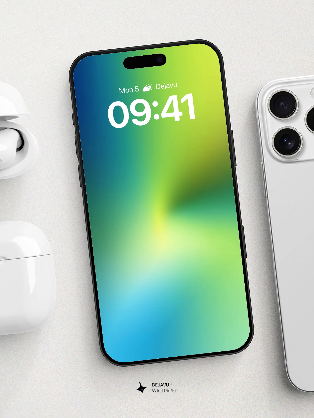
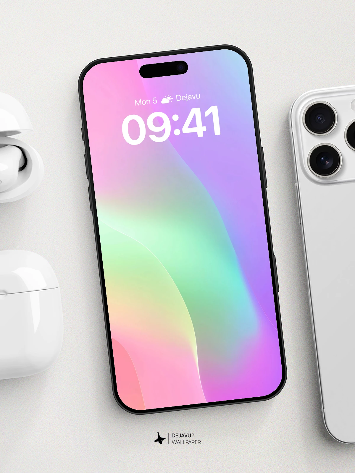
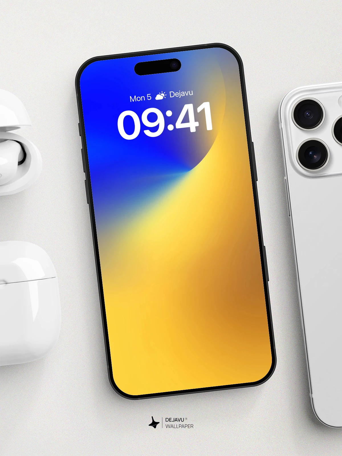
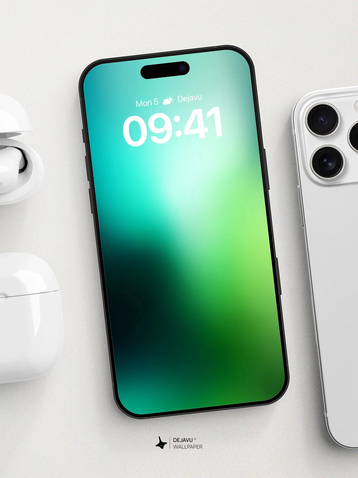
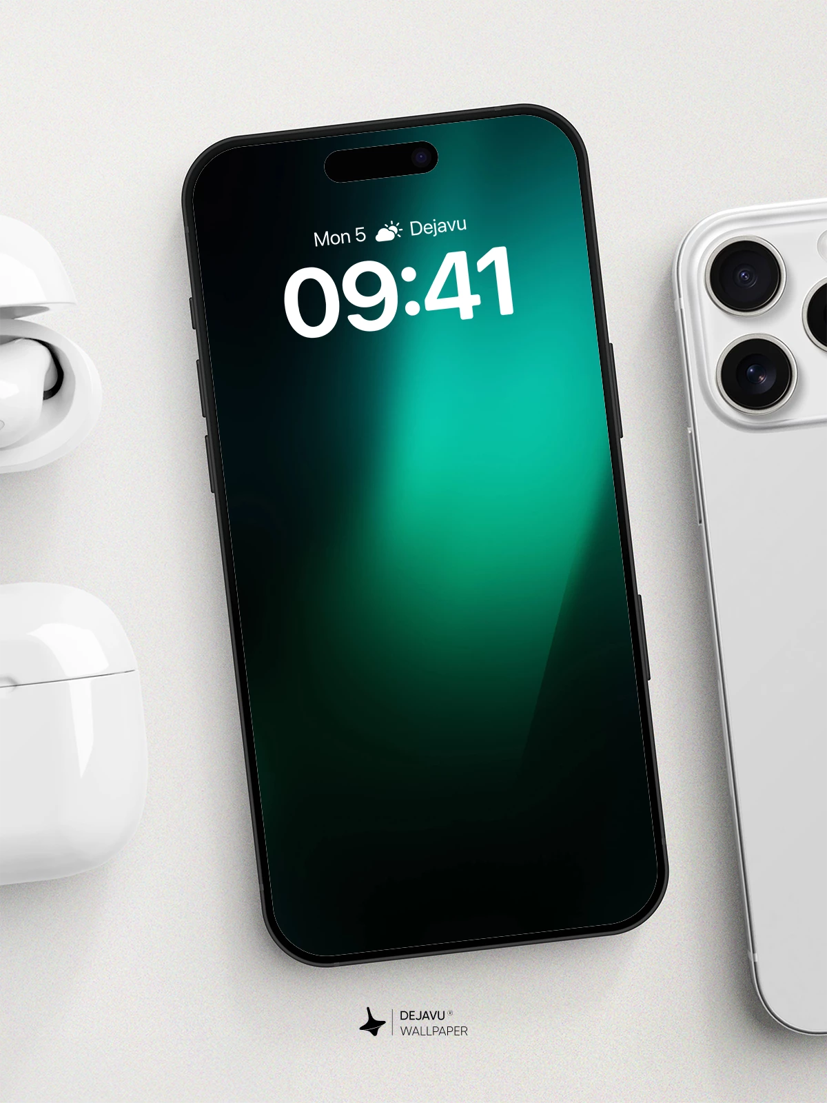
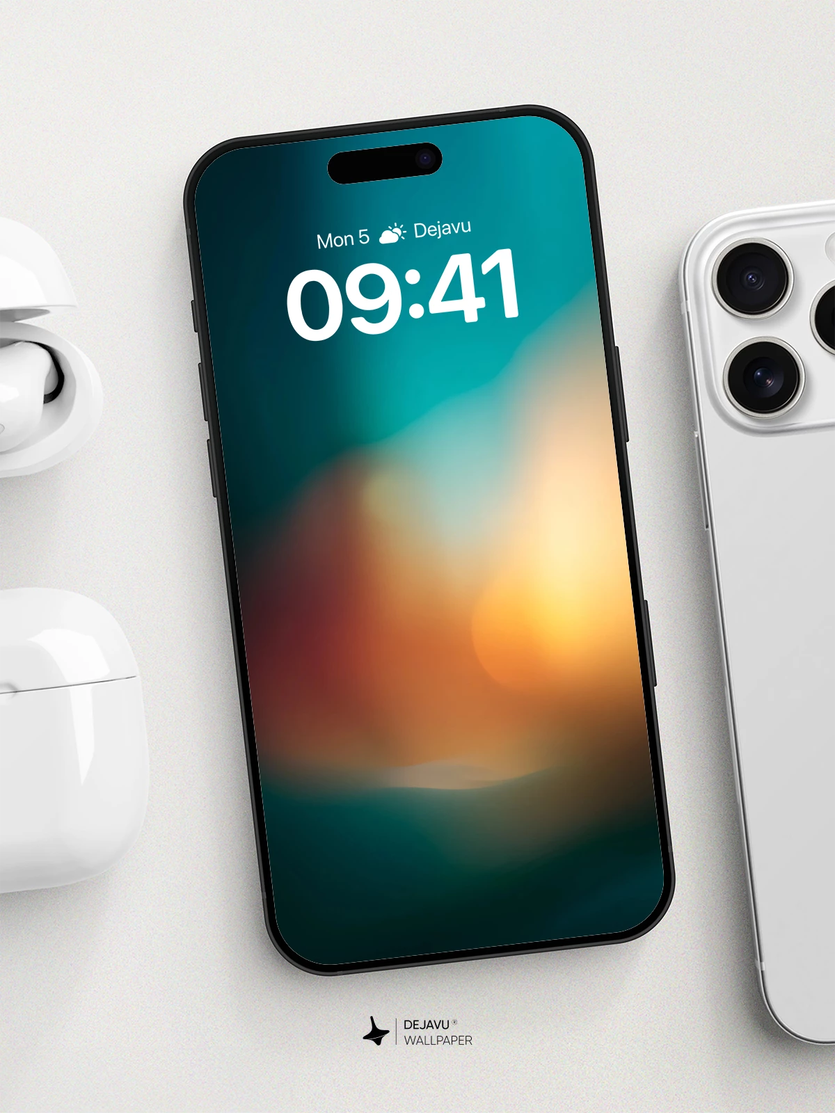
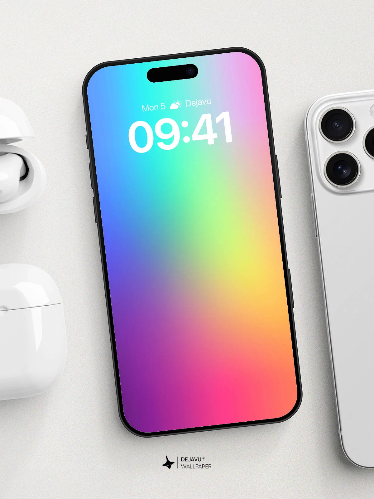
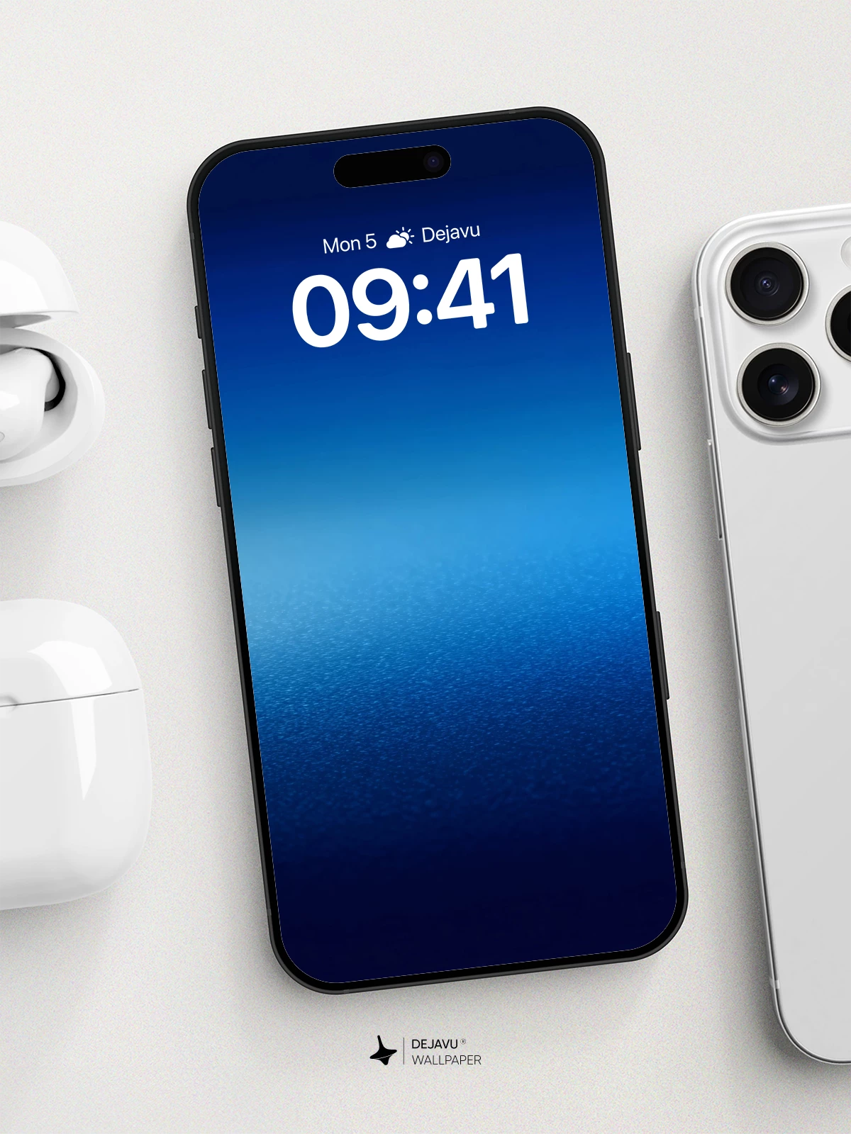
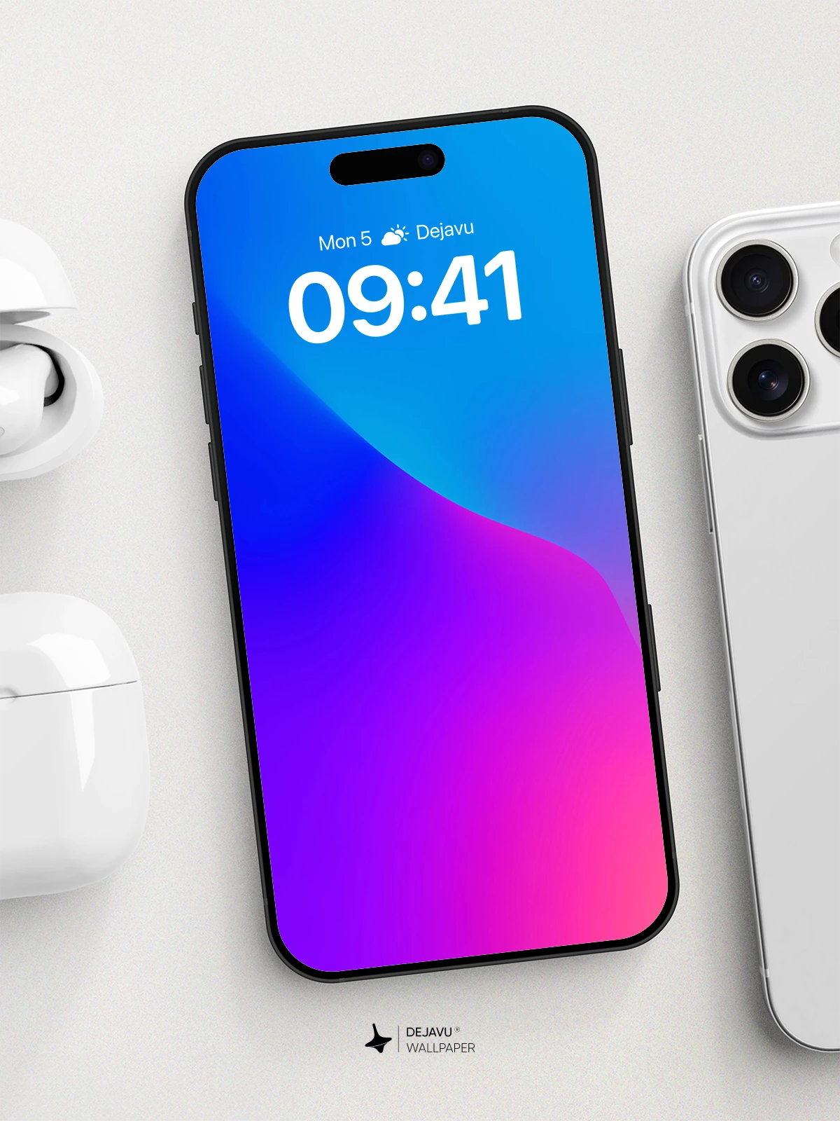
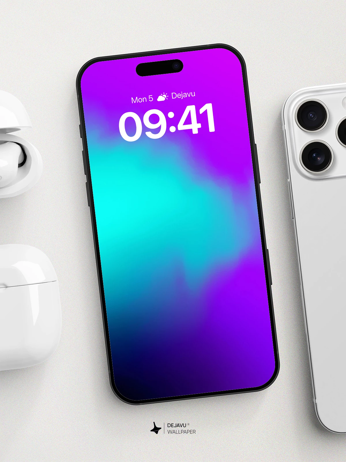
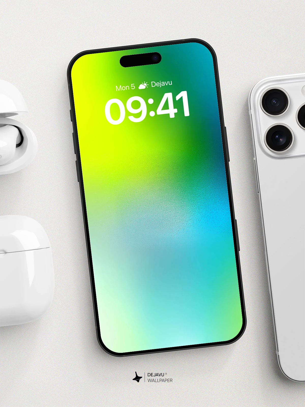
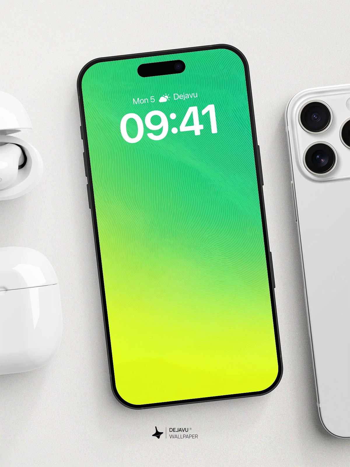
Each gradient carries specific emotional codes. The shift from deep magenta to navy suggests contemplation and solitude, while cyan and yellow blends evoke hope and energy. These palettes are deliberately engineered to align with psychological expectations across contexts. For instance, morning apps favor warm tones to stimulate action, while night modes use cool hues to encourage relaxation. Here, color ceases to be subjective taste and becomes a quantifiable, optimized tool for mental influence.
Resonance of Abstraction
Despite lacking representational elements, these color schemes elicit broad emotional responses. They do not reference specific places or memories but summon universal human experiences—such as pre-dawn stillness, post-storm peace, or emotional waves. This non-representational quality grants them cross-cultural adaptability, positioning them as a shared language of global digital culture. In social media and virtual interactions, they function as emotional symbols, forming a new system of visual communication.