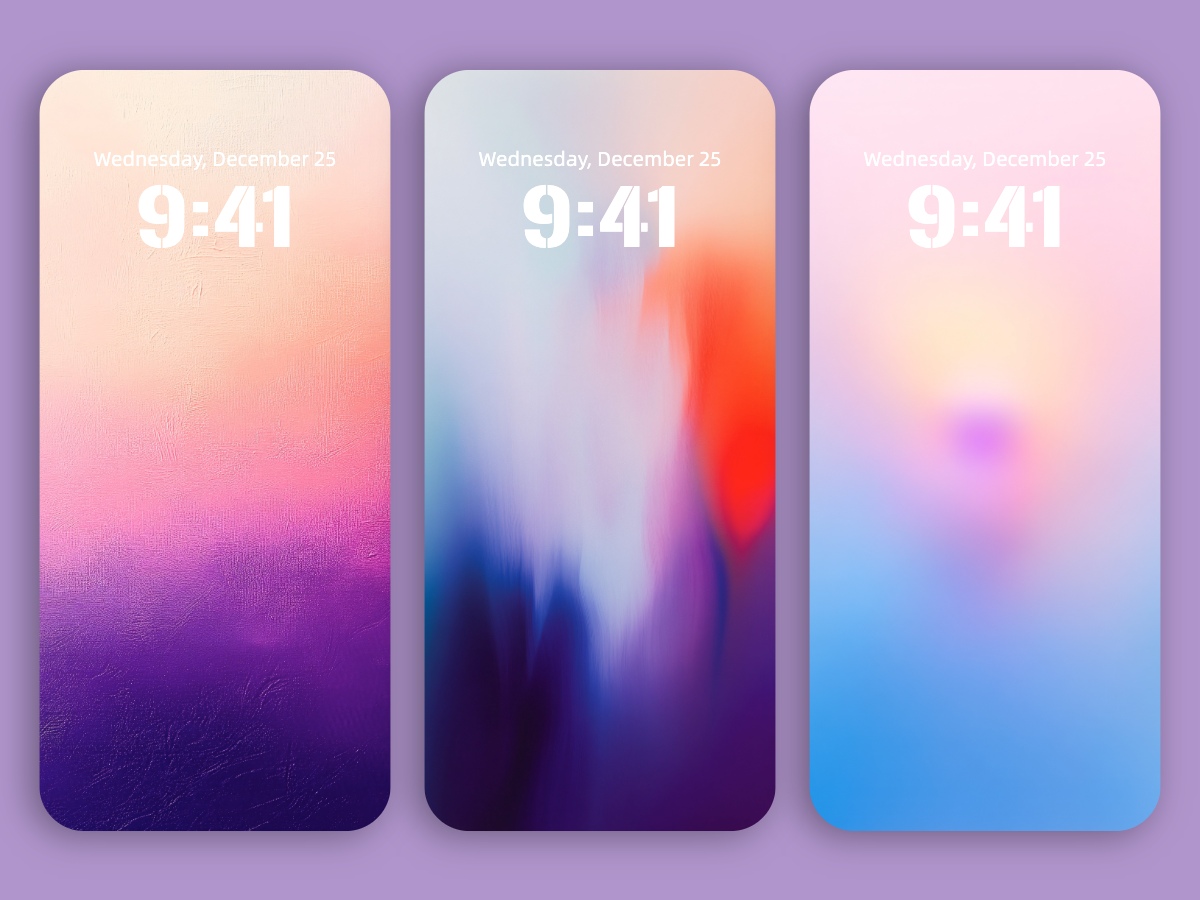

Who knew your phone screen could double as a mood booster? Introducing The Secret of Gradients: How Colors Shape Our Emotions and Perceptions — a stunning collection of 8K minimal gradient wallpapers designed to turn your iPhone or Android into a sleek color therapy canvas. These aren’t just pretty backgrounds — each gradient flows with intention, using color psychology to gently nudge your mood. Soft blues to calm, warm peaches to energize, dreamy purples to inspire — it’s like a subtle emotional reset every time you unlock your screen. Whether you’re into ultra-minimal vibes or just want something that quietly elevates your phone’s aesthetic, these high-res wallpapers are made to fit modern design lovers and mindful scrollers alike. Plus, with today’s growing obsession over wellness and digital serenity, you’re right on trend. Download your favorite gradient and let color do the talking — your inner peace (and phone) will thank you.
You can download all these wallpapers on Dejavu Wallpaper!
Experience the magic of AI in advance! Let the infinite imagination of AI decorate your screens, bring you fresh delights every day.


Gradients—those smooth transitions from one color to another—are everywhere, from nature’s breathtaking skies to cutting-edge digital designs. They may seem simple, but beneath their shifting hues lies a world of psychology, history, and artistic magic. Whether transitioning from warm to cool or light to dark, gradients have a unique way of evoking emotions, shaping our perceptions, and even influencing our moods.
The Origins of Gradients: Inspired by Nature
Before artists and designers started using gradients, nature had already perfected them. Picture the sunrise, where deep purples slowly give way to fiery oranges, or the ocean, where cerulean blue gradually darkens into a deep, mysterious abyss. The natural world has long been the master of blending colors, creating breathtaking displays that inspire awe.
Artists throughout history have attempted to replicate nature’s seamless transitions. Renaissance masters like Leonardo da Vinci and Titian used a technique called sfumato—which means “soft” in Italian—to blur edges and create realistic, dreamy transitions between colors and shadows. Take a closer look at the Mona Lisa’s famous smile, and you’ll notice how da Vinci’s subtle shading gives her that mysterious, almost lifelike expression. It’s all about gradients!
How Do Different Gradients Affect Us?
It’s no secret that colors impact our emotions, but did you know that gradients can subtly influence how we feel? Studies suggest that different gradient combinations create distinct moods:
- Warm gradients (pink to gold): These give off a sense of comfort, romance, and happiness.
- Cool gradients (blue to purple): They create a calming, peaceful vibe, often associated with logic, serenity, and mystery.
- Contrasting gradients (blue to orange, for example): They strike a balance between warmth and coolness, often resulting in a feeling of equilibrium and visual interest.
This is why brands like Instagram have leaned into gradients—its iconic pink-to-purple-to-blue logo exudes creativity and energy, making it instantly recognizable.
The Magic of Gradients in Design
Gradients have taken the design world by storm. From smartphone wallpapers and website backgrounds to fashion trends and product packaging, they add depth, dimension, and vibrancy. Gradients create a sense of motion, guide the eye, and add a contemporary touch to any visual composition.
But gradients aren’t just for aesthetics. They have practical applications, too. Some psychological studies suggest that soft pastel gradients, like light pink blending into baby blue, can have a calming effect. This is why certain hospitals and mental health spaces use pastel gradients to foster a soothing environment. The gradual shift in colors can subtly slow down our heart rate and help clear our minds.
Fun Gradient Facts You Might Not Know
- The “Sunset Gradient” Phenomenon: Ever wonder why sunsets are so mesmerizing? During sunset, the shorter wavelengths of blue light scatter, allowing the longer red, orange, and pink wavelengths to dominate the sky, creating that dreamy gradient effect.
- The Warm-Cool Balance: Psychological experiments have found that when warm colors like orange and cool shades like blue blend together in a gradient, people’s heart rates tend to stabilize. This balance of colors is thought to have a therapeutic effect on mood and stress levels.
- Trick of the Eye: Graphic designers use gradients to add depth and realism to 2D images. By carefully layering colors, they create an illusion of volume and movement, drawing the viewer’s eye toward specific elements in a design.
The Future of Gradients: Endless Possibilities
Gradients have come a long way from Renaissance paintings and natural landscapes. They’ve evolved into a major design trend, shaping brand identities, digital interfaces, fashion, and art. As technology advances, we can expect even more innovative uses of color transitions, from interactive digital experiences to responsive smart textiles.
So next time you find yourself mesmerized by a sunset or staring at a beautifully blended wallpaper, take a moment to appreciate the magic of gradients. They do more than just please the eye—they tell stories, evoke emotions, and weave color into our daily lives in ways we may not even realize.