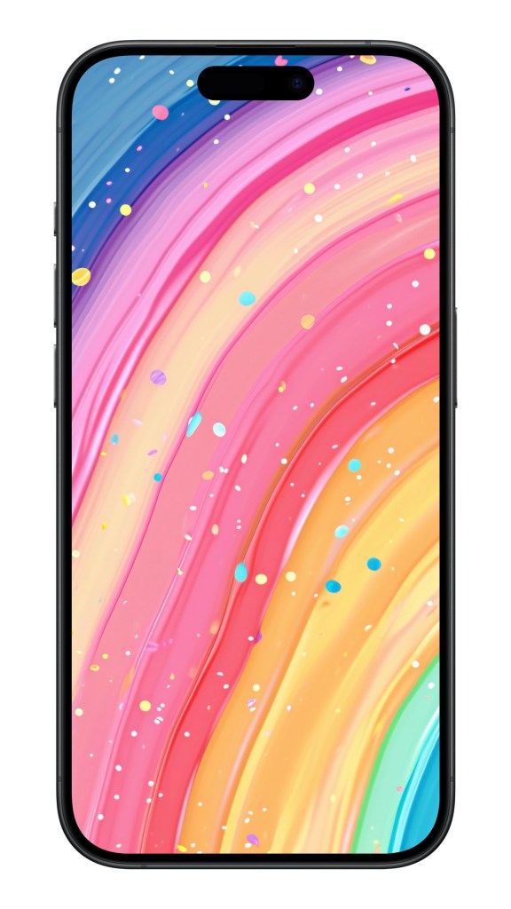
In today’s world, smartphones are practically extensions of ourselves, and mobile wallpapers? They’re the perfect canvas to flaunt your personality and style. Bright, colorful wallpapers are all the rage, thanks to their eye-catching appeal and the splash of fun they bring to our screens. But there’s more to this trend than meets the eye—it’s a delightful mix of psychology, design innovation, and tech advancements.
The Feel-Good Factor of Colors
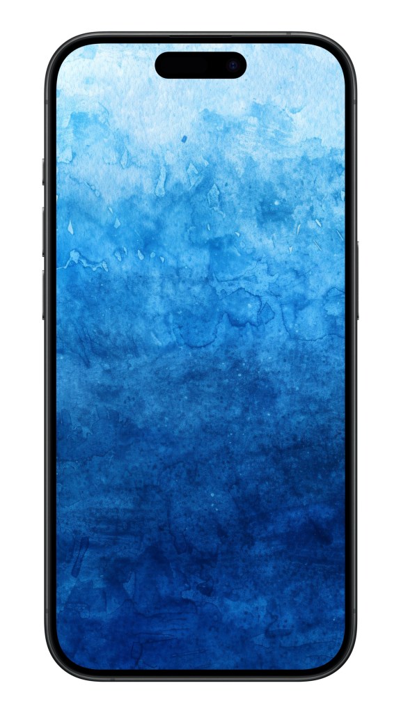
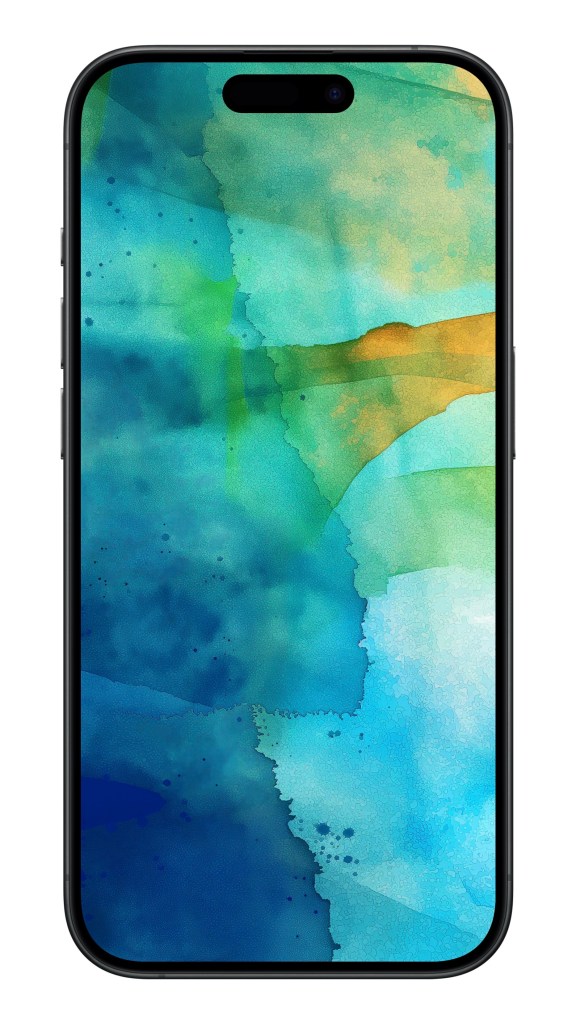
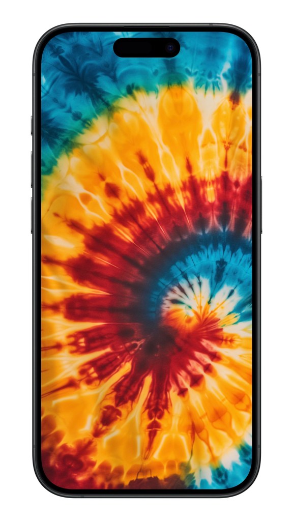
Did you know that the colors on your phone can actually affect your mood? It’s true! Research shows that colors have a big impact on how we feel and behave. Bright and vibrant hues can lift your spirits and boost your energy levels. For instance, reds and oranges are known to be lively and exciting, while blues and greens can help you chill out and relax. So, when you set a colorful wallpaper, you’re not just making your screen look good—you’re also giving yourself a little emotional pick-me-up every time you glance at your phone.
The Gradient Revolution
Remember when the iOS 7 update hit and suddenly everything was all about gradients? Apple introduced those dreamy color transitions, and we were hooked. Steve Jobs’ obsession with sleek, minimalist design and an intuitive user experience made gradients a go-to aesthetic. Not to be left behind, brands like Meizu and Xiaomi jumped on the bandwagon, incorporating gradient wallpapers into their operating systems. This trend is a perfect example of how great design can blend beauty and functionality.
Tech Magic Behind the Colors
Today’s smartphones come packed with cutting-edge display tech that makes those colorful wallpapers pop like never before. With AMOLED and OLED screens, we get richer, more vibrant colors and deep, inky blacks. This tech wizardry ensures that your wallpapers look super vivid and almost lifelike, turning every glance at your screen into a mini visual delight.
Harmony with App Icons
One of the coolest things about colorful wallpapers is how well they play with app icons. Designers often create wallpapers that complement the icons, making the whole interface look cohesive and aesthetically pleasing. Apple’s and Android’s semi-transparent or minimalist icon designs stand out beautifully against vibrant backgrounds, creating a balanced and visually appealing home screen.
A Melting Pot of Cultural Influences
Colorful wallpapers are a global phenomenon, influenced by various cultures and artistic traditions. Whether it’s the vibrant shades of Japanese anime, the intricate patterns of traditional Chinese floral art, or the bold strokes of Western abstract art, these diverse elements blend together, creating unique and eye-catching designs. Thanks to globalization, these rich cultural influences are easily accessible, enriching our screens with a variety of visual delights.
The Everlasting Appeal
Colorful wallpapers are here to stay, thanks to their blend of aesthetic appeal, psychological benefits, and cultural richness. They do more than just beautify our screens—they can subtly boost our moods and well-being. As technology keeps advancing and cultures continue to intermingle, the trend of colorful wallpapers will keep evolving, remaining a beloved part of our daily lives.
So, next time you unlock your phone and see that burst of color, remember: it’s not just pretty—it’s a vibrant celebration of art, culture, and cutting-edge tech, all rolled into one!
You can download all these wallpapers on Dejavu app:
Experience the magic of artificial intelligence in advance! Let the infinite imagination of AI decorate your phone, bringing you fresh delights every day.


What does gradient mean in color?
A gradient in color is like a magical transition where hues slowly blend into one another, creating a visually pleasing effect. Imagine the sky at sunset, where the fiery oranges gradually melt into soothing purples and deep blues. This seamless color shift can add depth and dynamism to designs, making them pop and feel more alive. In logos, gradients can be a game-changer, adding modern flair and visual interest. Despite some debate over their trendiness, gradients are undeniably eye-catching and can make a brand stand out in a sea of flat colors. Think of them as the visual equivalent of a beautiful melody that flows smoothly from one note to another.
What is the word for color gradient?
A color gradient, also known as a color ramp or color progression, is a fascinating visual tool in color science that fills an area with a smooth transition between multiple colors. Imagine the sky during a sunset, where colors seamlessly shift from vibrant oranges and pinks to deep purples and blues. This gradual blending can add depth and dimension to images, maps, and designs, making them more visually appealing and informative. Essentially, a color gradient transforms a simple color scheme into a dynamic spectrum, where each hue flows effortlessly into the next, creating a captivating and continuous colormap that can evoke various emotions and atmospheres.

What are gradient tones?
Gradient tones are like the magic trick of the art world, transforming flat images into dynamic scenes. Imagine a sunset where the sky shifts seamlessly from deep orange to soft pink, or a mountain range where the shadows gradually lighten as the sun rises. These gradient tones aren’t just about color transitions; they add depth and realism, making a two-dimensional surface appear three-dimensional. Artists and designers use them to suggest light direction, creating an illusion of volume and space. So next time you admire a piece of art, look for those smooth color shifts that make everything pop and come to life!